The Grundy Logo
Before Prisoner started, Grundy had been deliberate and unchanging, having used the same logo on their creations seemingly since the dawn of time. Although the initial episodes had that same classic logo attached to them, very soon after changes started to be made, it would seem that Prisoner coincided with a change of identity for the company. Let's have a look at the various gems that were used in Prisoner. Click on the picture for a larger image. When years are mentioned, they refer to years of production, not years of airing.
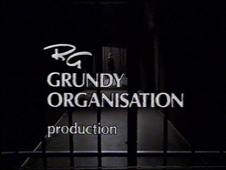
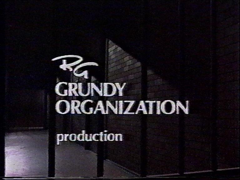
Logo 1 (Used episodes 1-7)
This is the classic Grundy logo which I mentioned above. The Grundy diamond had yet to be invented, here the company still used the old 'RG' insignia.
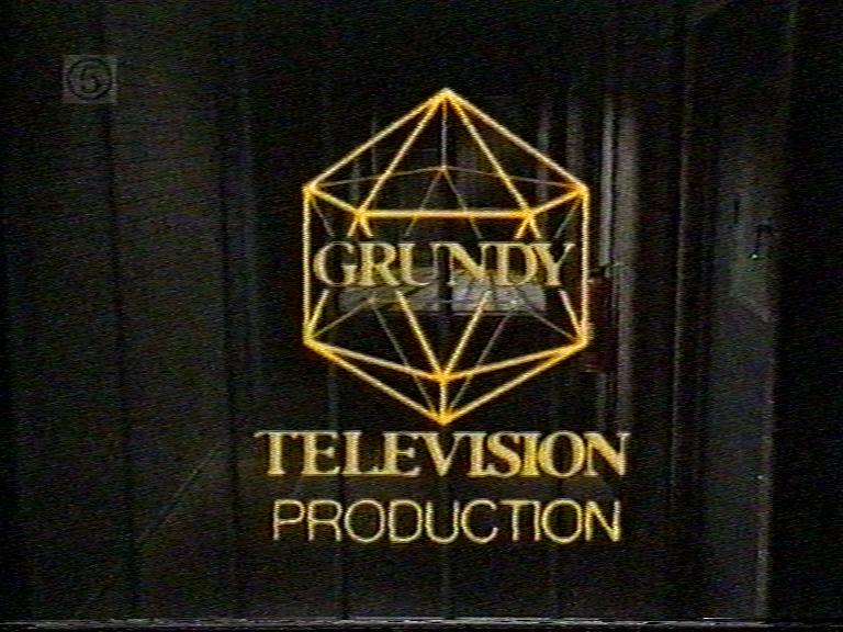
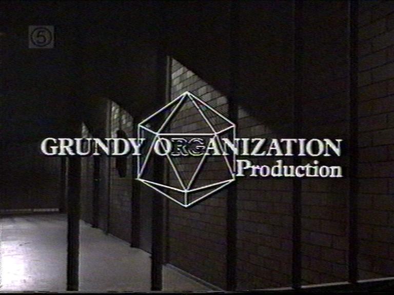
Logo 2 (used episodes 8-86)
 Grundy decided
that 1979 would be a year of change for them, introducing this new logo in late
1978 (eps 1-16 of Prisoner were produced in 1978, despite them having a 1979
copyright date). Hardly a major new look, all they've done is modify the
spelling 'organisation' to use a Z instead of an S, and at the same time made
the logo a tiny bit smaller. Although it's regular use ended with episode 86, it
did make one more appearance during 1980, around episode 130ish. If you can pin
down the exact episode before I can, please email
me.
Grundy decided
that 1979 would be a year of change for them, introducing this new logo in late
1978 (eps 1-16 of Prisoner were produced in 1978, despite them having a 1979
copyright date). Hardly a major new look, all they've done is modify the
spelling 'organisation' to use a Z instead of an S, and at the same time made
the logo a tiny bit smaller. Although it's regular use ended with episode 86, it
did make one more appearance during 1980, around episode 130ish. If you can pin
down the exact episode before I can, please email
me.
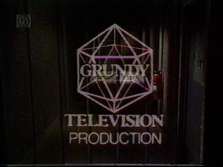
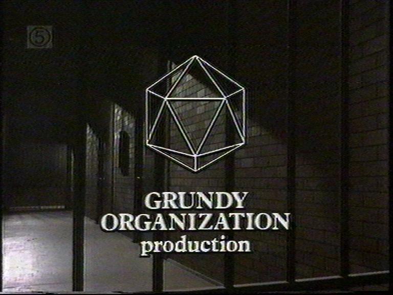
Logo 3 (used episode 87-late 1980)
 After taking the
first steps towards a new image during 1979, Grundy decided to take it even
further during 1980. Introducing this new logo in late 1979, this introduced the
well-known diamond symbol, which would remain with the company for almost 20
years. However, they weren't quite ready to loose the old 'RG' initials quite
yet, notice how they have been included in 'Organization' by making the R
and G transparent. Quite a clever idea.
After taking the
first steps towards a new image during 1979, Grundy decided to take it even
further during 1980. Introducing this new logo in late 1979, this introduced the
well-known diamond symbol, which would remain with the company for almost 20
years. However, they weren't quite ready to loose the old 'RG' initials quite
yet, notice how they have been included in 'Organization' by making the R
and G transparent. Quite a clever idea.
Grundy International Logo
The current set of Prisoner tapes in circulation have this logo in a couple of 1980 episodes. I do not believe that it was used originally, so it is not included as a numbered logo here. The fact that it refers to Grundy as 'Grundy International' rather than 'Grundy Organization' or 'Grundy Television' and that it does not implies that this was designed and added by Grundy International Operations. Looking at the styling of it, it probably is a genuine 1980 logo, so presumably this was done for tapes destined for transmission in America.
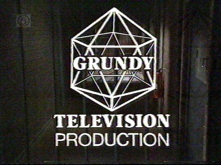
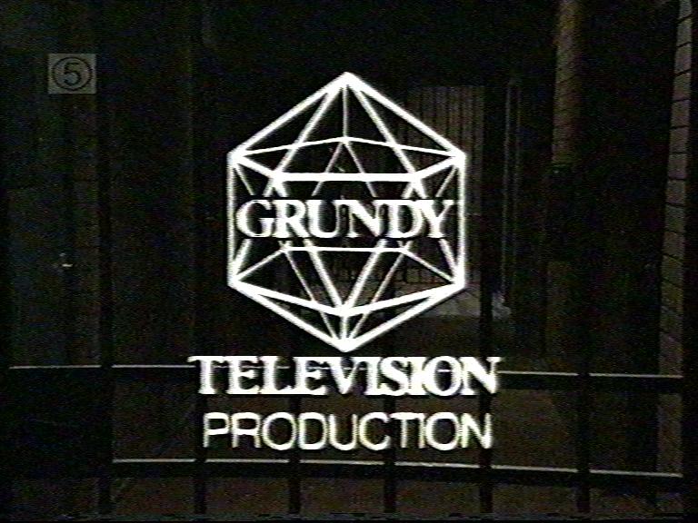
Logo 4 (used late 1980-1982)
 Around the time of
the 1980 tunnel escape storyline, Grundy introduced a further new logo. This was
really just an update of Logo 3. The lettering has been re-arranged, and the RG
initials have finally been consigned to the scrap heap, not appearing on this
logo at all. This was the second longest-running logo, being used for the
remainder of 1980 aswell as all of 1981 and virtually of 1982 (where Logo 5 was
used for a couple of episodes).
Around the time of
the 1980 tunnel escape storyline, Grundy introduced a further new logo. This was
really just an update of Logo 3. The lettering has been re-arranged, and the RG
initials have finally been consigned to the scrap heap, not appearing on this
logo at all. This was the second longest-running logo, being used for the
remainder of 1980 aswell as all of 1981 and virtually of 1982 (where Logo 5 was
used for a couple of episodes).
Logo 5 (used twice in 1982)
I do not presently have a copy of this logo, but Logo 5 was Grundy's first attempt at producing an animated logo, rather than just a static slide. Introduced in early 1982, on programmes such as 'Sons and Daughters' this logo completely replaced the old one, but with Prisoner it only appeared on two episodes before Logo 4 was reintroduced for the remainder of 1982. There were no fancy computer graphics in use here, this logo was made using traditional stop-frame animation. The animation could have benefited with a few more frames, as it was very juddery. It consisted of the diamond symbol spinning into view from the rear of the shot, as 'Grundy Organization' moved in from the front, with the two meeting up in the middle to form something similar to Logo 3.
Aswell as missing out on this logo, there also followed a second animated logo introduced midway through 1982. This logo was never used on Prisoner at all, with the static Logo 4 continuing throughout. On this logo the lettering was re-arranged to make the final result look more like Logo 4. The animation was shortened, although it was also made a good deal smoother.
Logo 6 (used early 1983)
 In 1983, Grundy
Organization became Grundy Television, to reflect the fact that they were now
centred around TV production, whereas previously they had been involved in other
things aswell. Perhaps the graphics department were caught out by this name
change, as despite having produced two animated logos during 1982, they reverted
to a static caption for the first Grundy Television logo. This was the regular
logo for the initial episodes of 1983, before being replaced with Logo 7.
Whilst logo 7 was being tweaked, occasionally they used Logo 6 again. I believe
that it's final use was in episode 400 (which is where this screenshot came
from), although I may be wrong. If you know differently, please email me).
In 1983, Grundy
Organization became Grundy Television, to reflect the fact that they were now
centred around TV production, whereas previously they had been involved in other
things aswell. Perhaps the graphics department were caught out by this name
change, as despite having produced two animated logos during 1982, they reverted
to a static caption for the first Grundy Television logo. This was the regular
logo for the initial episodes of 1983, before being replaced with Logo 7.
Whilst logo 7 was being tweaked, occasionally they used Logo 6 again. I believe
that it's final use was in episode 400 (which is where this screenshot came
from), although I may be wrong. If you know differently, please email me).
Logo 7 (used remainder of 1983-episode 692)
 This is the one
which everyone remembers. This was used for well over 3 years on Prisoner, and
was the longest running logo used in the series. After Prisoner's demise, the
logo was still used in it's original form until the late 80's. Following this,
it was computer generated, and although there were 3 or 4 versions of it with
different animations, the basic layout of the logo remained the same until the
diamond was finally withdrawn at the end of 1998 and replaced with the awful
gold 'G' that's currently in use. The animation (in the unlikely event that you
need to be reminded) consists of the diamond spinning into view from the rear,
finalling settling in the centre of the screen. 'Grundy' and 'Television' then
simultaneously 'unfold' onto the screen, and finally 'Production' slides up from
the bottom, with the final result looking almost exactly the same as the static
logo 6, the only difference being that it's a bit smaller. Although it doesn't
exactly push animation technology to the limit (it's nothing which couldn't have
been done in the 50's), it was a nice smooth animation and it worked quite well.
This is the one
which everyone remembers. This was used for well over 3 years on Prisoner, and
was the longest running logo used in the series. After Prisoner's demise, the
logo was still used in it's original form until the late 80's. Following this,
it was computer generated, and although there were 3 or 4 versions of it with
different animations, the basic layout of the logo remained the same until the
diamond was finally withdrawn at the end of 1998 and replaced with the awful
gold 'G' that's currently in use. The animation (in the unlikely event that you
need to be reminded) consists of the diamond spinning into view from the rear,
finalling settling in the centre of the screen. 'Grundy' and 'Television' then
simultaneously 'unfold' onto the screen, and finally 'Production' slides up from
the bottom, with the final result looking almost exactly the same as the static
logo 6, the only difference being that it's a bit smaller. Although it doesn't
exactly push animation technology to the limit (it's nothing which couldn't have
been done in the 50's), it was a nice smooth animation and it worked quite well.
Unfortunately, it's introduction into Prisoner wasn't so smooth. The version used initially was produced for 'Sons and Daughters' and so was yellow. In case people started to question why the logo was yellow when the rest of the credits were white, the producers decided that the logo should be white aswell. Apparently, a white version of the logo didn't exist, and so the yellow version would have to be made white. Grundy however made a complete pig's ear of it, and while it should have been a simple matter to change the colour electronically (as the BBC did with their mechanical globe - it changed colour several times during it's 14 years of use, but it was the same model all the time), they instead appeared to be patching it over with white. The original attempt at doing this failed, some yellow was still showing through making the logo very cream coloured. After being run for a few episodes, the static logo 6 and the yellow logo 7 were used whilst they decided what to do (there didn't seem to be any logic to which one they would use, but the yellow logo 7 saw more frequent use)
What they should have realised was that patching it wasn't the best way to do it. They could have changed the colours electronically like they should have done in the first place, they could simply have made the rest of the credits yellow to fit in with the yellow logo (they can do this easily by placing a filter over the rostrum camera - indeed they HAVE done this before with episode 127 as the light-coloured background used wouldn't have worked well with white credits), or they could even have resorted to making a completely new logo in white.
Instead, they opted to...patch it again! A few frames were cut from the beginning of the animation to give them less work to do, and there followed several more attempts at patching it over to make it white. This time the colours ranged from pinkish (the most common), cream (like the first version) or even one version which appeared to have green bits coming out of the sides!. These were all interspersed with yellow logo 7 and the occasional logo 6.
Eventually, they managed to successfully patch it over in white. This version was then used for the remainder of the series. Although they achieved their aim of making it white, the patching causes it to lack the resolution and detail of the original yellow version.
Above is the final white version. Below is the original yellow version (note how it looks better than all the others), along with one with one of the failed patched versions, followed by the final white version again so you can see the development before, after, and somewhere in between.